Thursday, February 26, 2009

Text Design


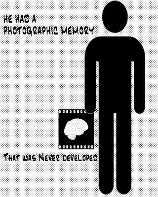
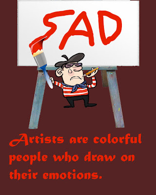
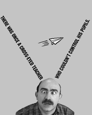
Which one of the four of your Text Designs is the most successful? In what ways?

The most successful design I made was probably the paws for concern one. It was the one that I was the most creative with, and put the most of my own detail in. I did some editing of images to give the man paws, and used a variety of tools in photoshop. It is creative, but it is also simple. It is important to have simplicity in design, and I felt that I reached that goal with this one.
List some of the tools that you learned and used in this assignment. Which ones did you find the most helpful and in what ways?
One new thing I learned about photoshop for this assignment was how to make the images black and white. Once I had made it black and white, I can then change the contrast and darkness of the images for my black and white one. Another helpful tool I learned was the clone stamp tool. This makes us able to copy a section of an image to fill in empty space. The most helpful tools for this assignment were the lasso and wand tools. These were used for the images that we found and wanted to use specific sections of, and get rid of unwanted pieces.
With regards to Design concepts and/or Photoshop tools, what do you think you need to know and what do you want to know?
In regards to the design concepts and photoshop tools, I feel that I need to explore more and be given new tools to use and assignments based around them. I am new to photoshop and design and I am not quite sure what I need to know. I am not aware of many of the tools available and I want to get to know them better.

Thursday, February 5, 2009


  1. Are you happy/satisfied with your design? What are some of the features that make it so successful? If you are not satisfied, what would you have done differently to make it more successful?
I am pretty satisfied with my design. It is successful because of the contrast of colors, and I think the colors add to the image. I think the color scheme worked pretty well, but a variety of colors would have worked better. I also like how the letters are stacked on top of each other, but they could have been arranged more creatively.
  1. List some of the tools that you learned and used in this assignment. Which ones did you find the most helpful and in what ways?
I learned how to rasterize and how to use that to do different things to shapes. I also learned how to warp the letters, and how to add many affects to them. I found the wand tool very helpful, as it helped select separate parts of the image to add different things to them. Another helpful tool was the eye dropper, which allowed me to repeat the same color as one that I have already used.
  1. With what areas/aspects of Photoshop do you have questions? What activities would help you better understand basic design concepts, along with more Photoshop tools, tips, and tricks?
Different activities that force us to learn a variety of new tools would be very helpful. If we keep expanding and using everything we can in photoshop, be will be better when we have more room for creativity. I sometimes have questions in how to overlap things, change specific parts of things, and just how to do some minor detailing in images.

Monday, February 2, 2009

Pop Art

What is pop-art?
Pop-art is when you remove objects from context and add it to other objects in order for it to look unique and abstract. Everyday objects are used in pop art, such as billboards and advertisements.

Stuart Davis
Stuart Davis contributed to The Masses by designing covers and drawings. He used contrast and flat patterns to rearrange natural forms. He began working with abstracts where he used letters and advertisements. He used cubism during the phase where synthetic materials were used.


Blips and Ifs
1963-64 (80 Kb); Oil on canvas, 71 1/8 x 53 1/8 in; Amon Carter Museum, Ft. Worth, Texas

I chose this piece because it looked unique and drew my attention. The blend of colors is unique and give it a bright, intriguing look. The words and lettering give it a curious look, it the unfinished words make the viewer wonder. The cut out shapes give it an abstract look, and the contrast of colors make the shapes stand out.

Robert Indiana
Robert Indiana mixes the ideals of America and the colors of pop art. He used experiences in his own life as inspiration to his creation with colors that match those you would see on the highway. He uses creativity to give meaning to simple words that have impacted his life. He uses bold letters in block shapes with clashing colors to create stamps like his famous postage stamp of “Love” in 1973.


The Book of Love 7

I chose this because it is one of his most famous. He uses the simple word “love” to create a stamp using blocked letters. He uses various colors to have many contrasts and effects. He has used this many times and created many variations of the word love.

Sunday, February 1, 2009