Monday, June 15, 2009


Tuesday, April 14, 2009

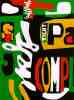
Logo Self Assessment
Name of your company, a short paragraph describing what your company manufactures/sells and the target audience for the product.
You are the CEO of a new company that manufactures non-gasoline automobiles and need a logo to represent your company; your target audience is young adults that are concerned about the environment...
Company Name: Mizu 水 (water in japanese)
This company sells cars that run on only H20. The cars are small and are designed to focus on young adults who have recently gotten their license and hope to be getting their first car.
Review the processes that Jacob Cass went through in designing his logo and Logo Design Secrets (and any other links that you found especially helpful). What parts of these processes did you use in your work. Please explain and be specific.
I use a simple design so that it is recognizable, easy to remember, and good to look at.
I tried to remember the idea of the company. The logo has to stand for the company’s idea and portray it in a visual, yet simple way. Also in the steps by Jacob Cass was that the goal is not to make something that will wow you once when you look at it. The goal is to make something that when seen over and over will leave an impact and everyone will know and recognize your logo.
Overall, what three important concepts have you learned about logo design? Explain why they are important to your future work?
I have learned that logo designs must be scalable to all sizes. This will help me in the future so that I will design something simple and easy to be changed and scaled. This way the logo can be used more and in a variety of ways to help keep the customer satisfied. The second thing I learned is to not necessarily have the logo be what you are selling. Companies like Mcdonalds and Nike do not include what they are selling in their logo, but are still successful. This will be helpful in the future because I will make a unique idea that wont be an image of what the company is selling. This way the logo will be known for the idea and not just the product. Lastly, I learned that the goal is not to make something that will wow you once when you look at it. The goal is to make something that when seen over and over will leave an impact and everyone will know and recognize your logo. This will be helpful because I will make a simpler logo that will be easy and good to look at, but when seen many times will leave an impact of the goal and message of the company.
Review the criteria and the process of designing a logo, please rate your final logo design, 1-4 (4 is the highest). Please explain why your work deserves the rating.
I believe I deserve a three for my logo. I followed the steps of making a simple design, but it was effective for my age group that it was targeting. I used my peers as help to edit, get ideas, and make progress on my design throughout the process of making it. Only 2 colors were used, and the message of the company was clear through the name and shape of the design.
Thursday, April 9, 2009
Reflection of Logo Design - Midpoint
- What significant changes has your logo gone through?
- Why did you make these changes?
- How much more work needs to go into the logo? What more do you need to do? (Please check criteria)
- What questions do you have?
Friday, April 3, 2009
Quarter Three Self-Assessment
What are you most proud of? What do you think are your strengths?
I am most proud of my google designs. I think that my strengths are to make something creative within the boundaries. I learn to use what I know to the best of my ability. My ideas are good, and it shows my strength of creating and using a few tools, but what lacks is that I have more to learn.
What would you like to do better and/or focus upon for Quarter four?
In quarter four I would like to make myself more creative and expand my knowledge of design and photoshop. I will focus on stretching my creativity and creating better ideas.
How will you make this happen?
In the first quarter I used what I knew to be as creative as I could with my knowledge and background for design and the tools we used. What I hope to do in the next quarter is to learn even more about design so I will be able to expand. Hopefully I will be able to learn more about photoshop to expand my creative options and variety of my creative designs. My ideas will become better by learning to accept feedback and use it to make my designs better. I also have to learn that the first idea isn’t always the best, and not be stuck on anything. If you are stuck on something, it limits creativity, and this quarter I hope to learn as much as I can and apply it to my work.
Monday, March 30, 2009
5 Logo design steps
List and describe (in your own words) the 5 important steps in designing a logo.
Starting out is important. Don’t use clip art to save time or money, but use your own original idea.
Use a simple design so that it is recognizable, easy to remember, and good to look at.
Make sure your logo can easily change sizes. You will need it to be small as well as large, so if it is too complicated it won’t work at a small scale.
Remember the idea of the company. The logo has to stand for the company’s idea and portray it in a visual, yet simple way.
The goal is not to make something that will wow you once when you look at it. The goal is to make something that when seen over and over will leave an impact and everyone will know and recognize your logo.


Thursday, March 26, 2009
Triangle and Rectangle Tessellations


Which tessellation did you find more interesting to do? In what ways was it more interesting than the other? Please explain.
Look at your peers' work on the ning . Which two designs do you find the most successful? What qualities make them so successful?
The most successful was the one that was teal with red dots, and used the gradient tool (rectangular). This was successful because the gradient tool made the separation of the shapes clear. Also, they used details inside the design to make it stand out more and look more unique. The second one that was successful was Dan's dinosaur design (rectangular). He used detail that made it clear what the image was, but also made the tessellation work well. He used bold lines to make the individual images stand out, and made very nice details inside the image to give it an effective appearance.
Looking at the Grading Criteria for each design, how would you rate BOTH designs on a scale of 1-4, 4 being the highest? Please explain each grade.
For the second one, I would give myself a 3. I think my craftsmanship is high quality, and I consistently zoomed in to make sure everything fit well. I felt I picked a part of the photo that would create a unique, unified design. I think my final design has a nice outcome because of the bright colors and the unique patterns on the wings of the butterflies.
Friday, March 20, 2009
Intro to Tessellation

Tessellation
What is a tessellation?
Pictures of tiles of images of animals and other figures in patterns that don’t overlap or leave gaps.
M.C. Escher
Escher became good at graphic art as a kid, and decided to change his medium to wood. He went to the School for Architecture and Decorative Arts until 1922. After realizing that he had potential in the woodcutting field, he decided to change directions.
He later moved to Italy and created a lot of his landscape designs from various angles and complex ideas. rbmsl
As a child, he was interested in filing the plane without overlapping or leaving spaces. He made his actual first tessellation in 1925. After that he began to create wallpaper tessellations. By the end of his life he had over 130 tessellations that were mind blowing and amazing designs. M.C. Escher became famous for his masterful drawings, and impossible ideas that made you look deep into the image.
Monday, March 16, 2009

Power “Plant”
I wish that the world would be more aware of the environment. I wish that people would use less harmful gases and toxins to help the environment.

Carbon Footprint
I wish that the world would be more aware of their carbon footprint, and leave a greener one for a healthier environment.
I improved my designs by finalizing my work. I outlines some of the images to make them stand out more, and made some things darker so there would be more contrast. They all liked my ideas, but had helpful suggestions for me to improve them.
The first thing I learned was how to use the brush tool in different ways. I learned that you can change the hue variation and the separation of the brush tip. I also learned how to be creative, but stay within specific boundaries. This is important for design students because you need to know how to think outside the box, but at the same time stay within the requirements. If you have to do an advertisement, you have to stick to a criteria, but still be unique and creative. Lastly, I learned how to take advice and use it to make a better final result.
Power “Plant”
I think I deserve a 3 because I stuck within the criteria, and made it my own unique idea for creating the letters. I thought this design was successful because of the unique way of creating the letters to spell the word google.
Carbon Footprint
I think I deserve a 3 because I made it interesting, but kept it simple at the same time. It was successful because of the simplicity. It is important for designs to be simple, and the way that the word google fit inside the foot helped create that effect. Also, the contrast of the light and dark colors made it stand out well.
Tuesday, March 3, 2009

Thursday, February 26, 2009
Text Design


Which one of the four of your Text Designs is the most successful? In what ways?
The most successful design I made was probably the paws for concern one. It was the one that I was the most creative with, and put the most of my own detail in. I did some editing of images to give the man paws, and used a variety of tools in photoshop. It is creative, but it is also simple. It is important to have simplicity in design, and I felt that I reached that goal with this one.
List some of the tools that you learned and used in this assignment. Which ones did you find the most helpful and in what ways?
One new thing I learned about photoshop for this assignment was how to make the images black and white. Once I had made it black and white, I can then change the contrast and darkness of the images for my black and white one. Another helpful tool I learned was the clone stamp tool. This makes us able to copy a section of an image to fill in empty space. The most helpful tools for this assignment were the lasso and wand tools. These were used for the images that we found and wanted to use specific sections of, and get rid of unwanted pieces.
With regards to Design concepts and/or Photoshop tools, what do you think you need to know and what do you want to know?
In regards to the design concepts and photoshop tools, I feel that I need to explore more and be given new tools to use and assignments based around them. I am new to photoshop and design and I am not quite sure what I need to know. I am not aware of many of the tools available and I want to get to know them better.
Thursday, February 5, 2009

- Are you happy/satisfied with your design? What are some of the features that make it so successful? If you are not satisfied, what would you have done differently to make it more successful?
- List some of the tools that you learned and used in this assignment. Which ones did you find the most helpful and in what ways?
- With what areas/aspects of Photoshop do you have questions? What activities would help you better understand basic design concepts, along with more Photoshop tools, tips, and tricks?
Monday, February 2, 2009
Pop Art
What is pop-art?
Pop-art is when you remove objects from context and add it to other objects in order for it to look unique and abstract. Everyday objects are used in pop art, such as billboards and advertisements.
Stuart Davis
Stuart Davis contributed to The Masses by designing covers and drawings. He used contrast and flat patterns to rearrange natural forms. He began working with abstracts where he used letters and advertisements. He used cubism during the phase where synthetic materials were used.
Blips and Ifs
1963-64 (80 Kb); Oil on canvas, 71 1/8 x 53 1/8 in; Amon Carter Museum, Ft. Worth, Texas
I chose this piece because it looked unique and drew my attention. The blend of colors is unique and give it a bright, intriguing look. The words and lettering give it a curious look, it the unfinished words make the viewer wonder. The cut out shapes give it an abstract look, and the contrast of colors make the shapes stand out.
Robert Indiana
Robert Indiana mixes the ideals of America and the colors of pop art. He used experiences in his own life as inspiration to his creation with colors that match those you would see on the highway. He uses creativity to give meaning to simple words that have impacted his life. He uses bold letters in block shapes with clashing colors to create stamps like his famous postage stamp of “Love” in 1973.
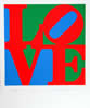 The Book of Love 7
I chose this because it is one of his most famous. He uses the simple word “love” to create a stamp using blocked letters. He uses various colors to have many contrasts and effects. He has used this many times and created many variations of the word love.
Pop-art is when you remove objects from context and add it to other objects in order for it to look unique and abstract. Everyday objects are used in pop art, such as billboards and advertisements.
Stuart Davis
Stuart Davis contributed to The Masses by designing covers and drawings. He used contrast and flat patterns to rearrange natural forms. He began working with abstracts where he used letters and advertisements. He used cubism during the phase where synthetic materials were used.

Blips and Ifs
1963-64 (80 Kb); Oil on canvas, 71 1/8 x 53 1/8 in; Amon Carter Museum, Ft. Worth, Texas
I chose this piece because it looked unique and drew my attention. The blend of colors is unique and give it a bright, intriguing look. The words and lettering give it a curious look, it the unfinished words make the viewer wonder. The cut out shapes give it an abstract look, and the contrast of colors make the shapes stand out.
Robert Indiana
Robert Indiana mixes the ideals of America and the colors of pop art. He used experiences in his own life as inspiration to his creation with colors that match those you would see on the highway. He uses creativity to give meaning to simple words that have impacted his life. He uses bold letters in block shapes with clashing colors to create stamps like his famous postage stamp of “Love” in 1973.
 The Book of Love 7
I chose this because it is one of his most famous. He uses the simple word “love” to create a stamp using blocked letters. He uses various colors to have many contrasts and effects. He has used this many times and created many variations of the word love.
Sunday, February 1, 2009

Tuesday, January 27, 2009

Monday, January 26, 2009
Subscribe to:
Posts (Atom)