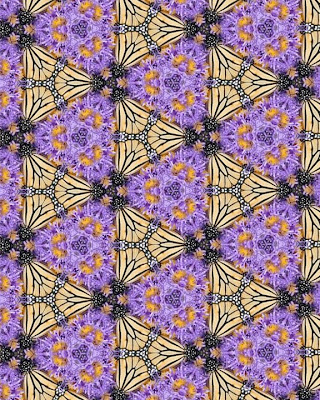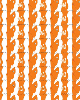

Which tessellation did you find more interesting to do? In what ways was it more interesting than the other? Please explain.
Look at your peers' work on the ning . Which two designs do you find the most successful? What qualities make them so successful?
The most successful was the one that was teal with red dots, and used the gradient tool (rectangular). This was successful because the gradient tool made the separation of the shapes clear. Also, they used details inside the design to make it stand out more and look more unique. The second one that was successful was Dan's dinosaur design (rectangular). He used detail that made it clear what the image was, but also made the tessellation work well. He used bold lines to make the individual images stand out, and made very nice details inside the image to give it an effective appearance.
Looking at the Grading Criteria for each design, how would you rate BOTH designs on a scale of 1-4, 4 being the highest? Please explain each grade.
For the second one, I would give myself a 3. I think my craftsmanship is high quality, and I consistently zoomed in to make sure everything fit well. I felt I picked a part of the photo that would create a unique, unified design. I think my final design has a nice outcome because of the bright colors and the unique patterns on the wings of the butterflies.
No comments:
Post a Comment