List and describe (in your own words) the 5 important steps in designing a logo.
Starting out is important. Don’t use clip art to save time or money, but use your own original idea.
Use a simple design so that it is recognizable, easy to remember, and good to look at.
Make sure your logo can easily change sizes. You will need it to be small as well as large, so if it is too complicated it won’t work at a small scale.
Remember the idea of the company. The logo has to stand for the company’s idea and portray it in a visual, yet simple way.
The goal is not to make something that will wow you once when you look at it. The goal is to make something that when seen over and over will leave an impact and everyone will know and recognize your logo.
Monday, March 30, 2009
Thursday, March 26, 2009
Triangle and Rectangle Tessellations
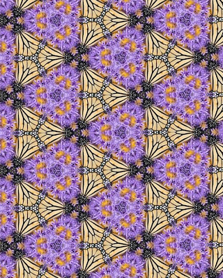
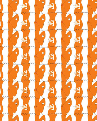
Which tessellation did you find more interesting to do? In what ways was it more interesting than the other? Please explain.
Look at your peers' work on the ning . Which two designs do you find the most successful? What qualities make them so successful?
The most successful was the one that was teal with red dots, and used the gradient tool (rectangular). This was successful because the gradient tool made the separation of the shapes clear. Also, they used details inside the design to make it stand out more and look more unique. The second one that was successful was Dan's dinosaur design (rectangular). He used detail that made it clear what the image was, but also made the tessellation work well. He used bold lines to make the individual images stand out, and made very nice details inside the image to give it an effective appearance.
Looking at the Grading Criteria for each design, how would you rate BOTH designs on a scale of 1-4, 4 being the highest? Please explain each grade.
For the second one, I would give myself a 3. I think my craftsmanship is high quality, and I consistently zoomed in to make sure everything fit well. I felt I picked a part of the photo that would create a unique, unified design. I think my final design has a nice outcome because of the bright colors and the unique patterns on the wings of the butterflies.
Friday, March 20, 2009
Intro to Tessellation
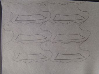
Tessellation
What is a tessellation?
Pictures of tiles of images of animals and other figures in patterns that don’t overlap or leave gaps.
M.C. Escher
Escher became good at graphic art as a kid, and decided to change his medium to wood. He went to the School for Architecture and Decorative Arts until 1922. After realizing that he had potential in the woodcutting field, he decided to change directions.
He later moved to Italy and created a lot of his landscape designs from various angles and complex ideas. rbmsl
As a child, he was interested in filing the plane without overlapping or leaving spaces. He made his actual first tessellation in 1925. After that he began to create wallpaper tessellations. By the end of his life he had over 130 tessellations that were mind blowing and amazing designs. M.C. Escher became famous for his masterful drawings, and impossible ideas that made you look deep into the image.
Monday, March 16, 2009
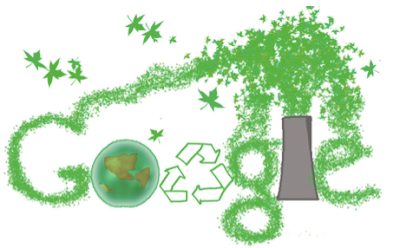
Power “Plant”
I wish that the world would be more aware of the environment. I wish that people would use less harmful gases and toxins to help the environment.

Carbon Footprint
I wish that the world would be more aware of their carbon footprint, and leave a greener one for a healthier environment.
I improved my designs by finalizing my work. I outlines some of the images to make them stand out more, and made some things darker so there would be more contrast. They all liked my ideas, but had helpful suggestions for me to improve them.
The first thing I learned was how to use the brush tool in different ways. I learned that you can change the hue variation and the separation of the brush tip. I also learned how to be creative, but stay within specific boundaries. This is important for design students because you need to know how to think outside the box, but at the same time stay within the requirements. If you have to do an advertisement, you have to stick to a criteria, but still be unique and creative. Lastly, I learned how to take advice and use it to make a better final result.
Power “Plant”
I think I deserve a 3 because I stuck within the criteria, and made it my own unique idea for creating the letters. I thought this design was successful because of the unique way of creating the letters to spell the word google.
Carbon Footprint
I think I deserve a 3 because I made it interesting, but kept it simple at the same time. It was successful because of the simplicity. It is important for designs to be simple, and the way that the word google fit inside the foot helped create that effect. Also, the contrast of the light and dark colors made it stand out well.
Tuesday, March 3, 2009
Subscribe to:
Comments (Atom)


